

Zelda II - The Adventures Of Link 1999
Original game : Zelda II: The Adventure of Link
Platform : NES
Author : Project Imperial
Release date : 29 January 1999
Category : Improvement
Patch version : 1999
Modifications : G
Downloads : 1972
ROM Information
Zelda II - The Adventure of Link (U).nes - GOODNES (3.14)Hack description
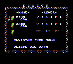
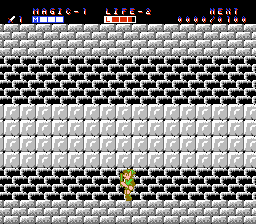
All dialouge changed.Screenshots
Contributions
| Contributor | Type of contribution | Description |
|---|
Reviews
| My eyes are still strained. | UsaSatsui | 2023-10-10 | Version 1999 |
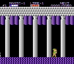
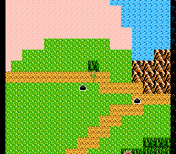
I streamed this today. There's no good way to put this - this hack is not pretty. There's a lot of work done on backgrounds, but it is hard to say it's an improvement most of the time. Also, instead of sticking to one visual style, the author changes them up in every area and every palace. This also goes for the fonts, which become very difficult to read in some cases, and it's just distracting at time. The backgrounds in the palaces ranged from "interesting but kind of annoying" like palace 4, to "ugly" like palace 3, and then...Christ in heaven who in their right mind thought palace 5 was a color palette *anyone* would want to ever look at? I was streaming it and had to beg people not to leave, it was so hideous and eye straining. It gave me headaches. Honestly, one of the main reasons I kept playing after that was to see what other monstrosities would follow. Sadly, the Great Palace itself is almost entirely untouched, as are the hero and enemy sprites. The new dialogue is unnecessary and uninteresting, with characters, items, and places renamed for no real reason at all (there was general uproar in the chat over Error's renaming). Some towns were renamed after people in the credits, and I don't really appreciate changing important things in the game over vanity. There are also several spelling mistakes, "Gannon" being the one that was the most triggering. I feel like if the authors had taken a single visual style and ran with it, the end result would have been better, since one of the most distracting things about the hack was how the font and graphics just keep changing constantly. There's effort here, I just feel like that effort went towards making poor decisions. | |||
| Double Vision | RetroSlayer14 | 2017-03-03 | Version 1999 |
Game was straightforward. some palaces had different colours and the such. the purple palace really is a twist with the foreground/background. no real glitches so it's a stable game. palace 5, the point bags are shaped as keys. I thought the keys were hilarious. Some spell names were funny and one particular spell description from the old man was pretty funny/accurate. here kitty... | |||
| Great Twist on an Oldie | Chris Miller | 2014-08-02 | - |
I'm really surprised nobody's commented on this yet. I downloaded this at Zophar's Domain, probably the same year it came out. Since then, I haven't seen another hack that has done as well with the graphics and fonts. Has nobody played this? Don't tell me it's been forgotten after a short few years. | |||