 GuestLog in
 GuestLog in
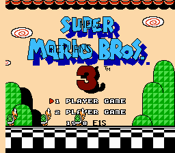
NEW Super Mario Bros. 3 Returns
Original game : Super Mario Bros. 3
Platform : NES
Author : English1stud
Release date : 07 December 2014
Category : Complete
Patch version : 1.1
Modifications : G, L, P
Downloads : 4248
ROM Information
Super Mario Bros. 3 (U) (PRG1) [!]Hack description
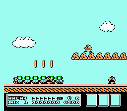
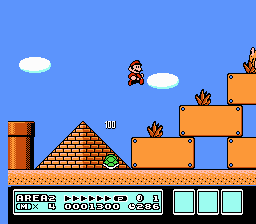
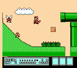
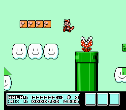
The true final installment to this series? You can say that, but not without the E1S touch. Something very unique is done for this truly last installment to the NEW series. This hack is complete with new graphics, some from the games, and some are original. Test your way through another set of new levels, repeated stages, default SMB3 level with slight modifications, and the map screens resemble the 1 path aspect of the modern Mario games. Enjoy folks!Screenshots
Contributions
| Contributor | Type of contribution | Description |
|---|---|---|
| English1stud | Hacking |
Reviews
| Questionable Aesthetic Decisions | M-Tee | 2014-12-17 | Version 1.1 |
Aesthetically, this game leaves a lot to be desired as graphic choices and visual layout seem not to be taken into consideration as changes were made. Major criticisms: The title screen is nearly illegible, with single-pixel thin black letters written directly over the logo that also contains outlines of the same value and thickness. In some levels, the hills have been given an arbitrary wavy pattern that's visually distracting and not related to their shape. It's neither organic looking enough to look natural, nor regular enough to be geometrically appealing. Stones have been used instead of blocks without taking into consideration the fact that they are not square. In fact, more than half of their top few rows of pixel are transparent, yet their collision is still coded as a solid square. This results in the player and enemies standing on air as they walk above them. Also, the large amount of transparent space looks silly when a pipe is growing out of them because the pipe stops immediately. Where does the pipe go? Obviously not into the ground because the sky is very visible throughout the ground below it. Other minor criticisms: Background and foreground elements are placed in manners which cause tangents. (the term tangents being used in the design aspect, meaning two visual elements placed close enough to each other to cause uncomfortable visual tension.) Also, some changes are inconsistent throughout. For example, vertical pipes have dithered shading, and horizontal ones have banded shading which, to make things worse, are occasionally placed directly adjacent to each other. Some Pros Area 1-2 features sunlit highlights on the sides of their hills, which are surprisingly done well, along with a sunset palette, and some very organic looking (although not stylistically matching) grass. However... Unfortunately, the level just mentioned seems unaltered in terms of gameplay, and for being the second level of the hack, gives little hope for the rest of the hack, although I didn't feel that the level designs of 1-1 or 1-3 were compelling enough to make me play further. In a Nutshell... There are a few solid graphic changes, but they're stretched between visually awkward and inconsistent levels which seem to be padded with unaltered levels from the original... perhaps could be cleaned up into something worth playing, but it'd take some pretty major effort. | |||