 GuestLog in
 GuestLog in
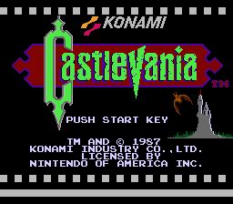
Castlevania - Dark Version
Original game : Castlevania
Platform : NES
Author : Alien X
Release date : 05 September 2015
Category : Improvement
Patch version : 1.0
Modifications : G
Downloads : 1042
ROM Information
Country: USAHack description
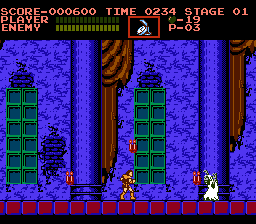
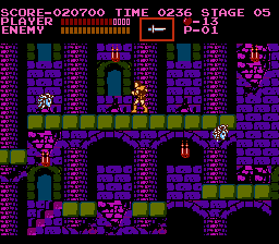
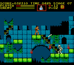
This is a hack that simply changes "Castlevania"'s color palette to a more grimy one.Screenshots
Contributions
| Contributor | Type of contribution | Description |
|---|
Reviews
| Stunning | Mother Kojiro | 2016-04-19 | Version 1.0 |
This version of the game is beautiful; the choices for the background colors are exquisite. My favorite is easily the first area, which begins with a deep purple, and has mulberry accents. The enemies often stick with pale colors close to white, so that they don't clash with the backgrounds, and it works well. Death's stage has a lovely palette, as well, though most all of the levels do. The only are that could use a little work is the last one, but Stage 18 is just as beautiful as the rest of the game. | |||
| Ugly | BlazeHeatnix | 2016-01-06 | Version 1.0 |
I went into this expecting something like F0's "Moody" hack for CV2. The backgrounds have interesting color choices to make them look moodier, but I found they made me more depressed instead. Some choices are very questionable, like water having a dark grey look that makes it look like gravel. The background colors also take some of the detail away from the scenery, such as the statues in level 3 now looking like greenish blobs. The enemies and items look much worse though. I played up to level 3, and every enemy and boss I came across was either completely grey, or this ugly bright shade of red. I'm guessing this was done in an attempt to make them look scarier or "bloody" but it just doesn't work, especially when it's applied to every non-boney enemy in the game, like crows (?!) So while I appreciate the attempt to make the game moodier, I don't like the result. This is no substitute for the original. | |||