


Castlevania 2: Simon's Quest - Moody
Original game : Castlevania II: Simon's Quest
Platform : NES
Author : 0 F
Release date : 07 January 2012
Category : Improvement
Patch version : 1.0
Modifications : G
Downloads : 3376
ROM Information
Castlevania II - Simon's Quest (U) [!].nes - GOODNES 3.14Hack description
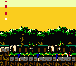
A cosmetic enhancement patch for giving a "moody" look to Castlevania 2 Simon's Quest (U).Screenshots


Contributions
| Contributor | Type of contribution | Description |
|---|---|---|
| F0 | Hacking |
Reviews
| More Natural and Idyllic than Moody | timeisup | 2020-04-06 | Version 1.0 |
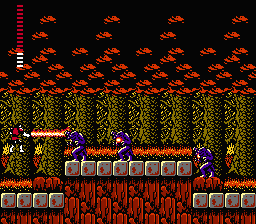
The Moody hack of Simon's Quest is a bit of a misnomer as it really goes for a more natural and realistic look outdoors. Perhaps the moody applies to the mansions which are garish to the point of being an eye sore. A few are very bright red or a red-green mix (Christmas edition of CV2?) while others are pastel yellow or deep dark blue. While the outdoors and towns do look nice and feature more natural Earth tones, that is not the appeal for CV2SQ for me. It IS a moody looking game with dark colors and the more mundane look of this hack is just boring, if well done. On the other hand the mansions hurt my eyes and almost make it unplayable. Didn't care for this one at all, but appreciating little things like the way the flowers pop in the woods or the idyllic sunset is novel but out of place in the Cursed land of Transylvania. | |||
| Personal Aesthetic Bias | Mother Kojiro | 2017-11-07 | Version 1.0 |
I love palette swaps, but I really wasn't into this one. Outside, it seems like it's going for a more realistic look, sticking mostly to greens and browns, but Simon's Quest's weirdness is part of what I liked about it, whether it be the strangely colorful palettes, the blank space rooms that you can explore in certain mansions, or even the way the bosses just kinda show up with no fanfare, almost like they're just some weird, super-durable one-off enemy; it makes a nice, strange experience. As for the mansions in this hack, they were a bit hit or miss for me. The first mansion is a lovely blood red, but it clashes with all of the green in most of the rest of the palette. On the other hand, the third mansion is a gorgeous deep red with a lighter blue for its background. All in all, it could be my personal color preference that makes me prefer the original over this hack; give it a try, if it sounds like your sort of thing, or even if you just want to play the game with a new coat of paint. | |||
| An amazing improvement that obsoletes the original game. | BladedEdge | 2012-06-10 | - |
I just joined Romhacking.net solely to sing praises for Moody Castlevania 2, because as the headline says, now that this exists there is no reason ever not to use it. What this hack does is change the colors in the game, but this simple change does a world of good for this fairly mediocre cart and makes it much more interesting to play. Both Castlevania 1 and Simon's Quest have, frankly, bizarre color choices in their original design: teals and light blues and purples mixing with ugly browns and bright yellows, clashing colors everywhere. What Moody does to fix this for Simon's Quest is change the palette to not only more realistic colors that blend together better and are nicer to look at, but also subtly suggest a level of depth in the backgrounds and add a bit of 3D space sense to things, as well as making locations in day and night actually look like the sun is/is not hitting them in fairly realistic ways (as far as 8-bit graphics can suggest, at least). The Mansions, as well, no longer look like the colors were simply selected at random, but have colors that actually blend together and suggest dirty dungeons or crumbling old ruins. It's amazing just what changing the colors for Simon's Quest has done for the game. The renewed, improved sense of atmosphere just plain makes the game better, not just nicer to look at. It's a boost that makes wandering a confusing Post-Drac Transylvania far more interesting, and worth revisiting for anybody who's played this in the past. Excellent, excellent work. Try it for yourself right away. | |||
| The world AFTER the curse | tcaudilllg | 2012-01-21 | - |
I gave this patch a spin a few days ago. The color changes were very refreshing. The game looks a lot prettier with finished archway paints and ochre deadwoods. And that' not a bad thing: Castlevania is a dark, drab world, sure, but should it really look dark and drab when Dracula is not in charge? The lush landscape and pretty colors hint that the crisis facing the land is something that lurks deep below the surface, which it is. The effort is not without its flaws; it does, for example, rely too much on purples at night, creating a strange otherworldly purplish glow reminiscent of Harmony of Dissonance. Also, the limitations of the color upgrade highlight just how constrained the game is graphically by its limited tile set. But overall, this patch offers a dose of reality and realism the like of which you wouldn't expect to encounter in a NES game. | |||