

Rudra no Hihou
Original game : Rudra no Hihou
Platform : Super Nintendo
Language : English
Released by : Aeon Genesis
Release date : 11 June 2015
Status : Fully Playable
Patch version : 2.10
Downloads : 19175
ROM Information
Rudra no Hihou (J).smc - GOODSNES 2.04Translation description
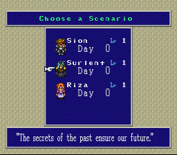
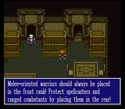
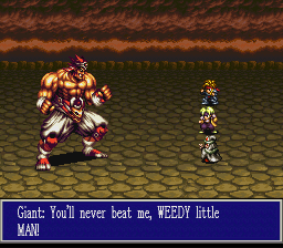
The 2.0 version polishes up and improves many things over the original release including a rewritten script, new VWF, polished intro hack, and more. Nice effort put forth by Gideon and AGTP. If you haven't played Rudra yet, this patch is surely recommended. Even if you have played it, it might be good for a second time through with this much improved patch!Screenshots
Contributions
| Contributor | Type of contribution | Description |
|---|---|---|
| Gideon Zhi | Hacking | Project leader, ROM hacker, translator, writer (v1) |
| Ian Kelley | Translation | Japanese translator |
| NinjaC64 | Translation | French translator |
| satsu | Translation | Spot dialogue translation (Japanese-English) |
| Moriyosi | Script Editing/Revision | |
| Matthew Kendora | Original Work | Script editing/revision (v1) |
| _Bnu | Original Work | Script editing/revision (v1) |
| BTAxis | Original Work | Script editing/revision (v1) |
| Boss Monkey Hayama | Hacking | Initial preliminary work on the table file |
Reviews
| What's with the obsession with the font? | FrigginNeato | 2023-02-10 | Version 2.10 |
This is a great game with a competent translation and I fully recommend it. Maybe I just don't understand the issue with the font because I use shaders, but the entire game reads fine to me. Another certified AG classic. | |||
| In response to the bad font | tsubasaplayer16 | 2022-04-27 | Version 2.10 |
Don't get me wrong, the translation is great (the game however is up to you on your opinion of the game itself), but it seems like some are being turned off by the text font, citing it as hard to read. Here's my experience with the game's translation text (and how it looks like on original hardware). Don't be fooled by the preview screenshots - that's not what the actual font looks like in-game unless your emulator settings make it look like so (turn off color bleed). If you want to know what the game's text actually looks like, check out World of Longplay's gameplay of the game that just came out a few months back (as of the time of writing this review): https://www.youtube.com/watch?v=tOD2z4zoj80 As for playing on original hardware with composite cables (the most budget-friendly way of playing the game), it's more or less the same result, only that it's a bit blurrier. However, 99% of the text is readable regardless of the picture quality barring some of the small M's and W's making it look like they're not really like M's and W's, but don't let that turn you off - the main dialogue of the game (like the 3rd and 4th screenshot) will be plenty readable for the average player, even on a CRT Television that only takes composite. Again, the preview screenshots don't look like that, it will be *plenty* readable once you play it. If you still aren't satisfied, then of course there's other ways you can always clean up the picture such as using S-Video or RGB. There's plenty of factors that depend on what kind of Super Nintendo you own and the type of cables and upscalers you may see online. I will stop with the details here since going into further details would make this review lead to an entirely different topic on its own, and there's plenty of details online that explain it, so please do your own research if you desire. Now, I agree that the font could be a lot better, however since it's been like 4+ years since the last update to the translation (being 2018), I doubt Aeon Genesis will update the translation to have "better" text sooner or later. I will update this review if that happened to be the case. Do I still recommend playing this translation? Sure, why not? This translation is there to *aid* you on what the game is about anyway, it's for people like me (and possibly you as well) who don't have the luxury to read and understand its original Japanese release, and the text as it is right now is plenty readable without difficulty. The game itself is up to you whether the game is good or not. (Played on original hardware with an FXPAK Pro. Similar results will occur with the Super Everdrive.) | |||
| Great translation, bad font | akaVanguard | 2020-04-27 | Version 2.10 |
I have read a few online-reviews of the fan-translated Rudra no Hihou and the reviewers praise the translation, but say the game is not on par with Squares other RPGs. I disagree. I absolutely love the game and the translation is fantastic. The font used however is really bad. I think they attempted to have the font use up the least amount of screen-space possible and sadly, it shows. Played the game in 1:1 in its native 240p. Tough to read, really unpleasant. Is it still worth it tho? Sure! The game is a lot of fun and you can tell they put a lot of love into that translation-patch! Just wish we could have an Addendum-patch with an easier to read font. | |||
| the text gives me a headache | RobbWes | 2020-02-08 | Version 2.10 |
the text is too blurry and makes me uncomfortable. | |||